How do I choose a paint colour I won’t hate in a year?
Choosing paint colours for your home can feel surprisingly daunting. Paint colour trends come and go. One year it’s all about teal, the next it’s blush pink with a hint of peach. Every year, paint brands unveil a new ‘colour of the year’, but the best paint colours for your home are rarely the ones dictated by passing trends. Today’s homeowners are moving away from magnolia and the endless shades of grey that once dominated interiors, opting instead for timeless paint colours and personal choices that reflect their style and personality. If you’re looking for room colour ideas and wondering how to choose a paint colour you won’t regret in a year’s time, this guide will help you pick an interior paint colour that feels right now and still looks great years from now.
Follow our quick guide to confidence in colour picking for a room that makes you smile for well over a year. And don’t forget – it’s just paint. If you hate it, change it!
How to choose a paint colour based on mood
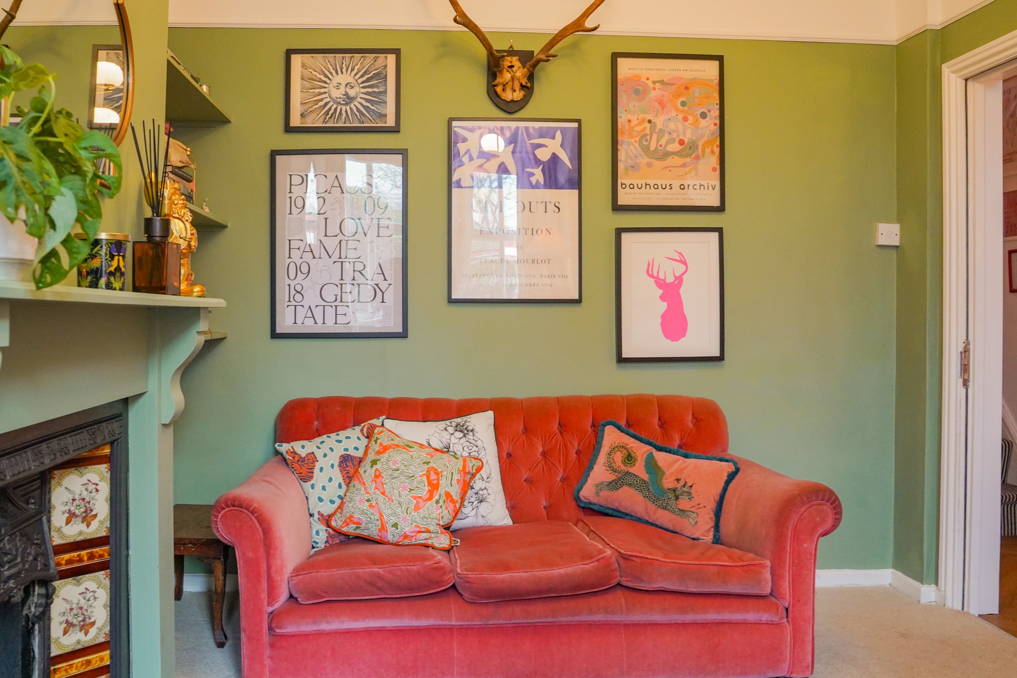
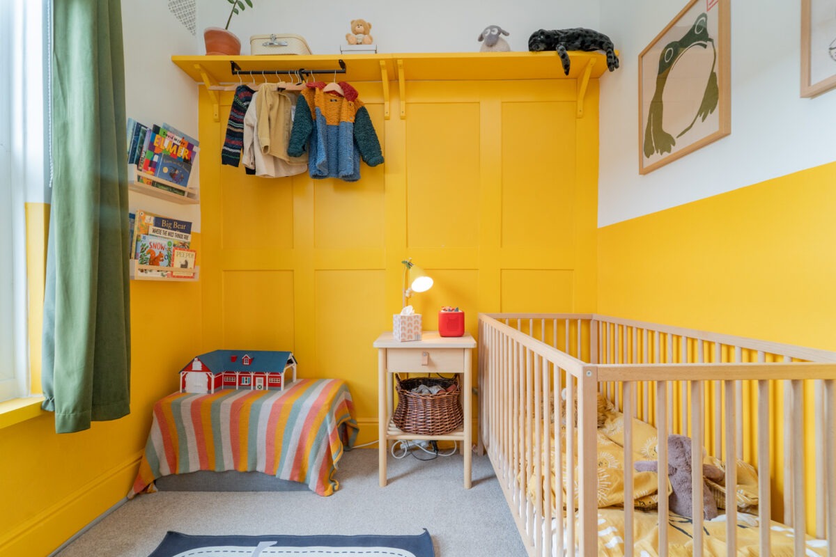
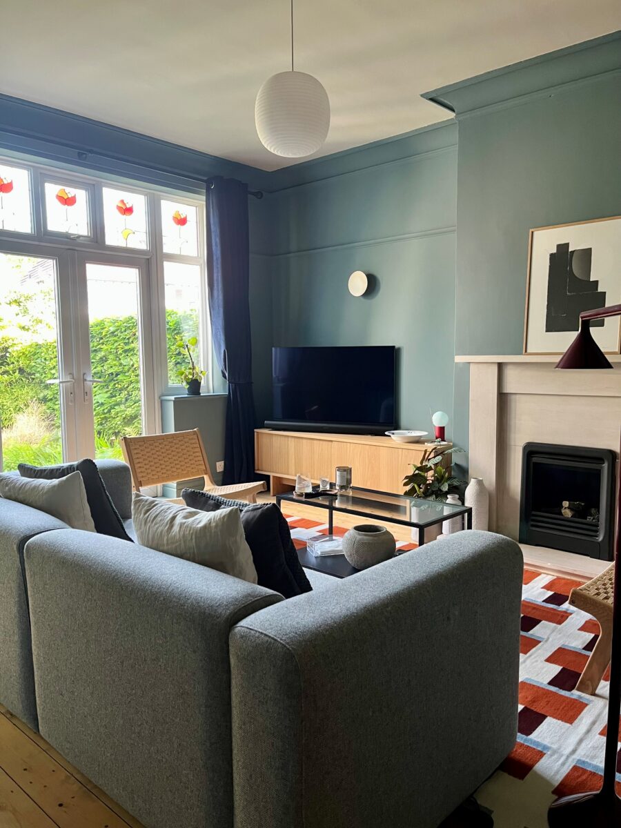
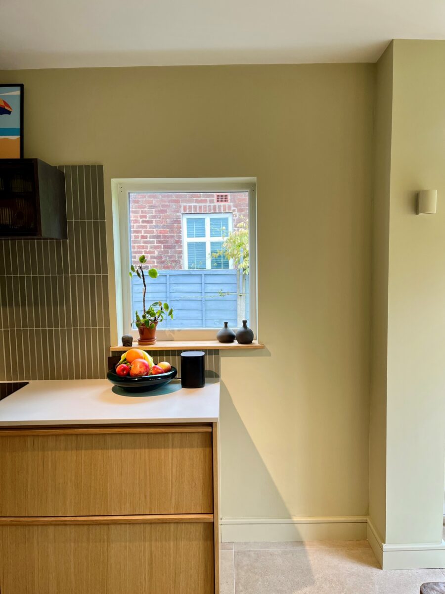
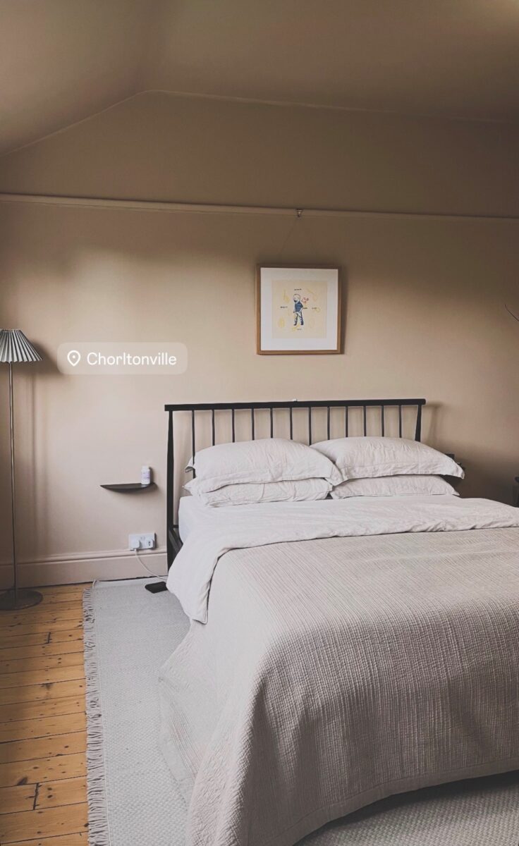
Before you even look at a paint chart, decide how you want to feel in the space: calm, cosy, energised or dramatic. Soft, muted colours usually feel more timeless, while very bright, high‑pigment shades are more likely to grate on you once the novelty wears off. Think about when you use the room and for what – a snug you only sit in at night can take a deeper, moodier tone than a north‑facing kitchen you are in all day. If you are nervous, aim for a versatile neutral or gentle colour on the main walls, then keep bolder hues for accents you can change more easily.
How to test paint colours before decorating
The biggest reason people go off a colour fast is that it looks nothing like the tiny rectangle they chose it from. Never trust the label or a small swatch alone: buy tester pots and paint large patches or, even better, A4 sheets of lining paper you can move around. Look at your samples on every wall and in morning light, afternoon shade and with your lamps on at night, because the same paint can shift from cool to warm or muddy to bright across the day. Live with those patches for a few days; if one still makes you smile every time you walk in, that is usually your safest long‑term bet.
Understanding paint colour undertones
Colours do not exist in isolation, so a shade you love on Instagram might fight with your flooring, worktops or sofa. Hold your painted samples against fixed elements like tiles, carpets, woodwork and kitchen units to see whether the undertones agree. Carry a sample card or painted lining paper with you when choosing new furniture or curtains so you don’t accidentally introduce a clash you will tire of quickly. If you are mixing several colours in one space, check them all together so one doesn’t shout louder than the rest.
Choosing timeless paint colours
It is tempting to copy the latest trending shade, but colour fashions move faster than most of us are willing to repaint. Ask yourself whether you like the colour because it genuinely suits your taste or because you have seen it everywhere this month. Trend‑led hues can still be great if they sit within a palette you have always loved – for example, a new shade of green when you already wear and decorate with greens. If you are unsure, bring the trend in through accessories and art, and use a more classic paint shade that can flex with different looks over time.
How paint finish affects colour
Finally, remember that how and where you use a colour affects how intense it feels. A deep shade on every wall can be overwhelming, but used on a single feature wall, woodwork or the lower half of a room it may feel rich rather than oppressive. Choosing a softer, low‑sheen finish usually looks calmer and hides wear better, which also helps you live happily with the colour for longer.
In the end, trusting your first honest reaction to a well‑tested sample is the best way to avoid waking up in six months and wondering what on earth you were thinking.
FAQs
How do I choose a paint colour I won’t get tired of?
Choose a paint colour based on how you want the room to feel rather than following short-term trends. Timeless shades, soft neutrals and colours you are naturally drawn to are more likely to remain appealing over time. Always test samples in your home before making a final decision.
Why does paint look different on the wall than on the sample card?
Paint colours are affected by natural light, artificial lighting, room orientation and surrounding furnishings. A colour can appear warmer, cooler, darker or brighter depending on the time of day and the room it is used in.
Do darker paint colours make a room feel smaller?
Not necessarily. Dark paint colours can create depth, warmth and character when used thoughtfully. In some spaces, deeper shades can make a room feel more inviting and sophisticated rather than smaller.
How important is paint finish when choosing a colour?
Paint finish can significantly affect how a colour looks. Matt and low-sheen finishes tend to soften colours and reduce glare, while satin and gloss finishes reflect more light and can make colours appear more vibrant.
Looking for a professional decorator?
I highly recommend Cam and his team at A Fresh Start on 07568 180019.

Eddie – Friday 5th June 2026.