The First 10 Seconds: What Your Front Door Says About Your Home..
There’s a moment, just before you step inside. where a home quietly introduces itself.
No grand gestures. No explanation. Just a feeling.
It might be the colour, the weight of the door, the way the light catches the hardware, or simply how everything sits together. But within seconds, you’ve already formed an impression.
And more often than not, it’s the subtle details that stay with you.
A More Considered First Impression
We often think about kerb appeal in terms of impact. But the most memorable entrances aren’t necessarily the boldest – they’re the ones that feel considered.
A freshly painted door. Hardware that’s aged well or thoughtfully chosen. A sense that the space is looked after.
It doesn’t need to be perfect. But it should feel intentional.
That’s what creates that immediate sense of ease – whether you’re arriving home at the end of the day or stepping up to a property for the first time. It’s subtle, but it shifts how you experience everything that follows.
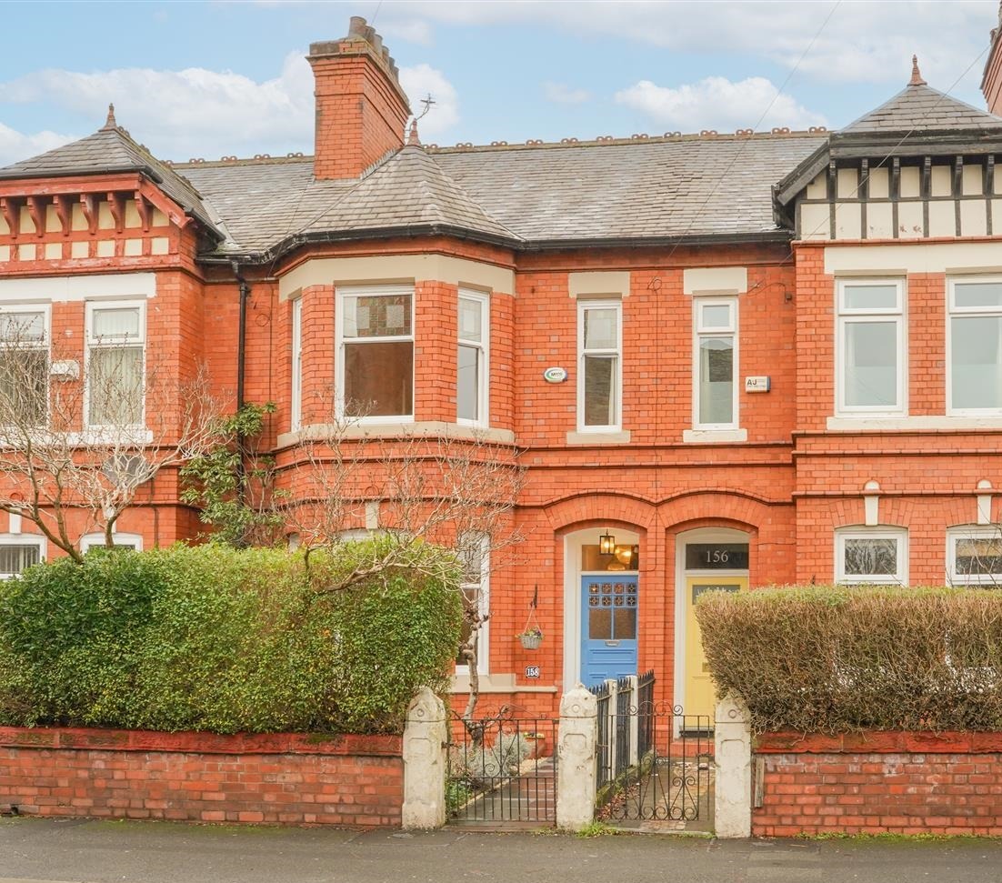
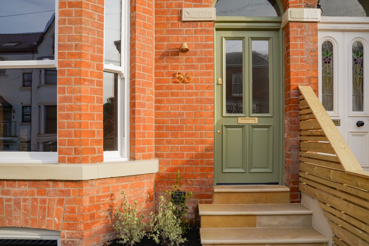
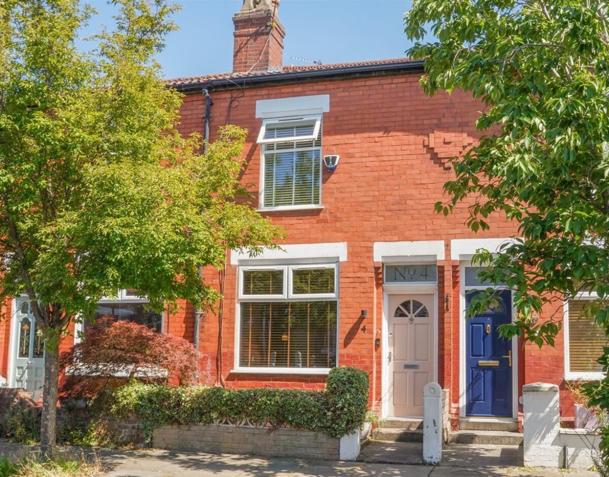
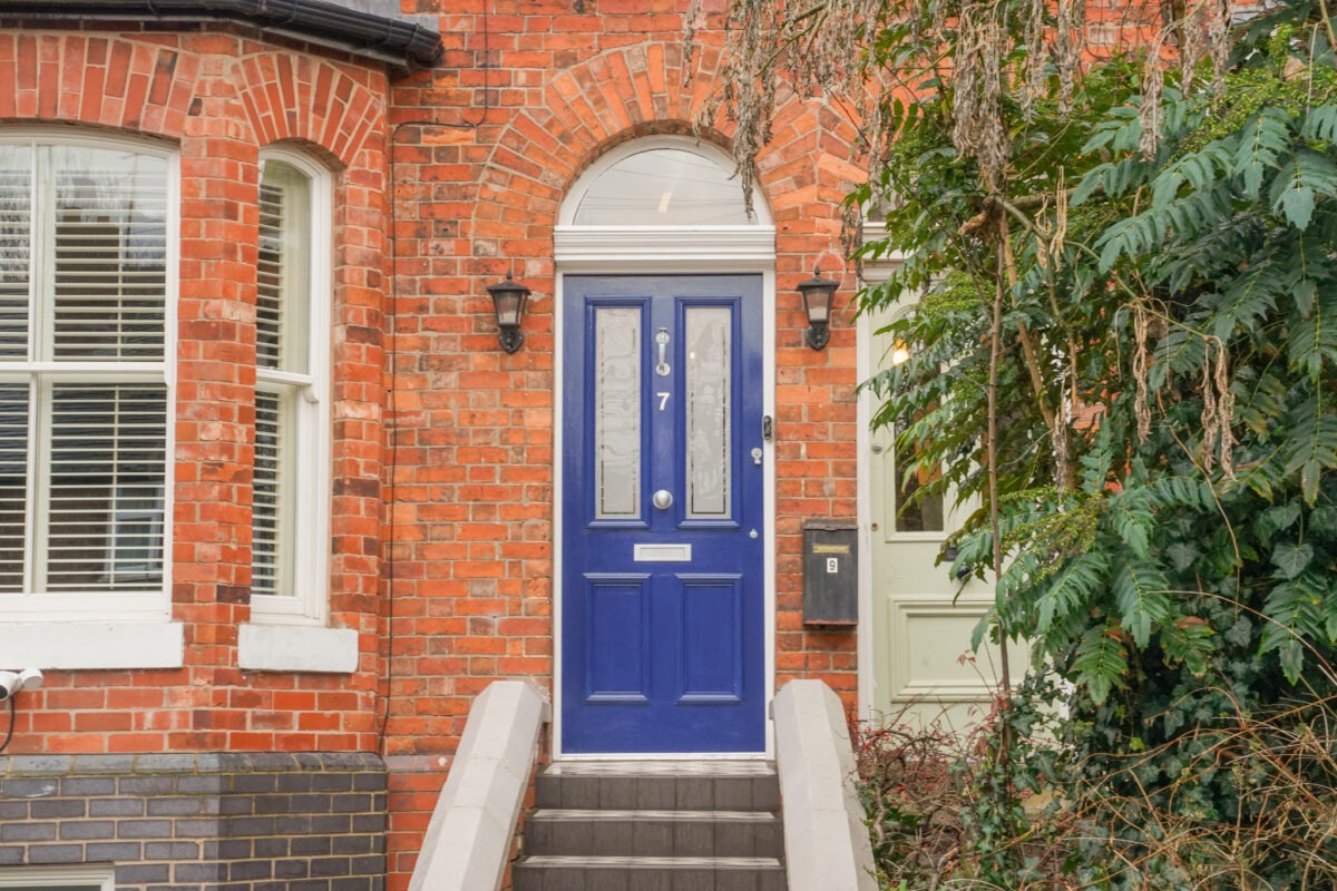
Front Door Colours for 2026
Colour is often the first thing you notice – but the shift we’re seeing for 2026 is less about making a statement, and more about choosing something that settles naturally into its surroundings.
The tones coming through feel softer, warmer, and more grounded. Easy to live with, and easy on the eye.
A few directions that are standing out:
- Soft, natural greens: calm, understated, and particularly at home against brick and stone
- Deep blues and inky tones: still classic, but slightly softened for a more relaxed feel
- Earthy shades: clay, terracotta, and warmer tones that bring depth
- Muted neutrals: taupe, putty, and chalky finishes that feel effortless but considered
- Dusky, softened pastels: a subtle way to introduce warmth without feeling overly decorative
The common thread is that nothing feels too bold or overworked. These are colours that sit comfortably with the architecture, rather than competing with it.
And choosing the right tone often comes down to context.
A softer green can feel completely at home on a Victorian terrace, complementing the texture of the brickwork. Deeper blues and charcoals tend to suit more structured facades, adding contrast without feeling too stark. Warmer tones, like clay or muted terracotta, can bring a gentle sense of warmth, particularly on entrances that don’t get a huge amount of natural light.
It’s less about following a trend, and more about choosing something that feels right for the home – and that you’ll enjoy coming back to every day.
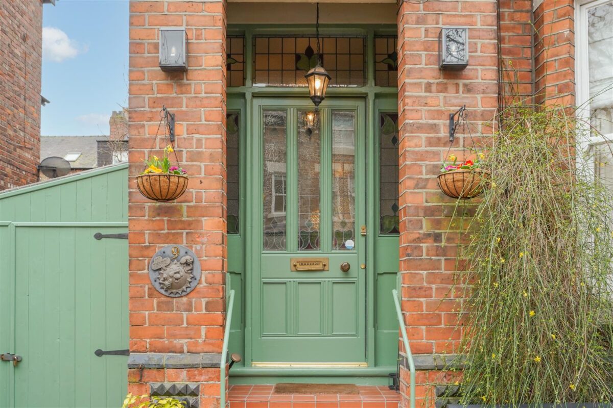
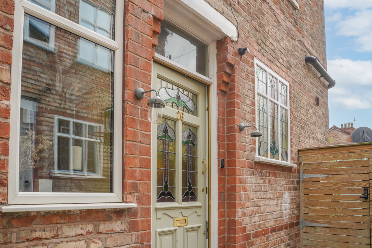
The Details That Elevate Everything
Once the colour is right, it’s the smaller details that bring everything together.
This is often where a front door shifts from feeling simply fine to something more resolved.
- Hardware: a well-chosen handle or knocker can subtly elevate the overall look. Brushed brass finishes or matt black can all work beautifully, depending on the style of the property
- Lighting: particularly important here in Manchester, where entrances are often seen in low light. A soft, warm glow feels far more inviting than anything too bright or harsh
- House numbers and signage: small, but surprisingly impactful. Keeping these simple and in keeping with the door makes a noticeable difference
- Planting: even one or two pots can soften the entrance and frame the doorway without feeling overdone
None of this needs to be over-styled. In fact, the most effective entrances tend to feel quite restrained and beautifully pulled together.
What Can Disrupt the Feeling
There are also a few things that can throw off that first impression, often without it being immediately obvious why.
Peeling or tired paint, mismatched finishes, overly bright lighting, or too many competing elements can make an entrance feel slightly unsettled.
It’s rarely about one major issue. More often, it’s a collection of small details that haven’t quite been considered as a whole.
The good news is that these are usually simple to address – and the impact is immediate.
If You Were Only Going to Change One Thing
If you were going to focus on just one update, I’d start with colour.
A well-chosen paint shade, applied properly, has the biggest impact. It instantly refreshes the entrance and makes everything else feel more intentional.
It’s one of those changes that feels small, but shifts the whole experience.
It Starts Here
If you’re preparing to sell, your front door is one of the simplest places to focus. It sets expectations before a viewing has even begun.
But beyond that, it’s something you return to every day – often without really noticing.
And when it’s right, it changes the way a home feels to come back to. Calm. Easier. More considered.
All from the very first second.
If you’re looking at your home and not quite sure where to start, a design consultation can bring clarity to those first decisions – from colour choices to layout and flow.
You can find out more and book via my website: https://spacesbykelly.com/contact/
Kelly Moorcroft
Interior Designer
Spaces by Kelly
Phone: 07554 149880
Email: kelly@spacesbykelly.com
Website: www.spacesbykelly.com/
Instagram: www.instagram.com/spacesbykelly
Eddie – Wednesday 1st April 2026. (Text supplied by Kelly and images used from JP & Brimelow marketing team).